9 min read

Published
December 15, 2020
How to Build Modern Layouts With CSS Grid

Marina
Frontend Developer
You want to make compound yet modern layout designs? Great, let me show you how to achieve that easily using just the CSS grid. So get comfortable, grab some sweets and let’s start - many examples await. :)
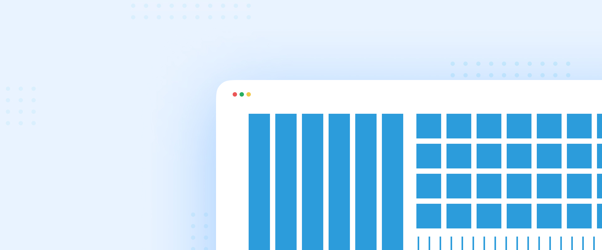
Unlike flexbox, the CSS grid is a two-dimensional system. It has vertical and horizontal lines that are defining rows and columns, which makes it easier to design web pages without having to use floats and positioning. A grid consists of one parent element - container, and one, or more child elements - items. The smallest unit in a grid is called a cell.
So far, these are the keywords you need to know. But let’s jump to the basic concepts to learn even more.
First things first, you want to create a simple UI by placing six simple divs (items) in the container. The container needs to be displayed as a grid. At this point, you won’t see any difference but make sure to check your browser once again. Inspect your page, your go-to elements, click on the layout tab, and mark grid overlays as checked. Now you should see the grid you created.
The next step is to define the rows and columns. To do that, you need to set the grid-template-columns and grid-template-rows properties to a certain value, e.g. 200px, 30%. You can do it in pixels, percentage, or any available unit you want in the container. If you like shorter formats, you can write only grid-template property with row/column values. For making space between cells, you can add the property grid-gap, or if you want to use the gap only between rows, use the grid-row-gap property (same applied for the column).
And voila, you created a grid containing 2 rows and 3 columns!

Now, try to resize your screen. You can notice that with the viewport change, those cells stay at the same size. Define the second column to be auto instead of value in pixels, and resize your screen once again. The first and third columns will stay the same and the second one is now flexible.
But, what if you want to make your grid even more responsive? Instead of using current column values, replace them with a new unit called a fraction. And there you go!
Let’s say we have 12 columns. Twelve times writing 1fr can’t be an elegant solution. Instead of that, you can use the repeat function which allows us to repeat columns as many times as we need. It takes two parameters to achieve this: number of repetitions and the size.
Let’s imagine a simple web page layout design with a header on the top, a menu sidebar, some content, and of course a footer at the bottom of the page. To achieve this, we’ll use the second example, with just a few modifications.
Before we start managing our layout, you need to get to know two new properties, grid-column and grid-row. Using them you can define from which to which point you want to expand your row and column.
For example, grid-column: 1/3; means the column starts from the first line of the grid, it expands over two columns and it ends at the third line. A different way to define the same thing is to write grid-column: 1/span 2;.
You could also start counting lines from right to left - then it has a negative value. So, if you want your row to start from the first line and to stop at the very end, you can write: grid-column: 1/-1;
With this knowledge, you can make a simple layout for a web page. Just target every item and define the grid-column and grid-row properties for each.
It will look something like this:

If the previous example was a bit messy due to counting lines, maybe you’ll find this one more helpful. There’s no counting at all and it’s pretty visual. :D
Instead of writing the grid-column and grid-row properties, just replace them with a single line property called grid-area. Give it a value - any name you wish, for example, h for header, m for menu, or f for footer. If you write a dot, the cell will be empty.
And one last thing to set: in the parent element define the property grid-template-areas in a way you want the elements to be displayed. Every body line represents a single row:
And the result is right here. OK, maybe this design is not the best looking, but you get the point.

So far, you’ve learned that using fractions will make the grid responsive and cells will expand as long as you increase the resolution on our screen, but also shrink as long as you decrease it. (The first grid image has a width of 300px and the second one 600px.)


But, what if you don’t want to expand the cells that much? What if you just want to have a minimum and maximum width of the column?
For that purpose, you can use the minmax function. Try with the divs from the first example, and let’s see how it’s going to change. You just have to define rows and columns. Columns will repeat and they’re going to have a minimum width size of 100px and a maximum width size of 1fr. That means, if you increase the resolution, as soon as the row has 100px free space, the next cell will take place right there.

Notice that the third row is not looking the same as the previous two and that’s because we defined only two rows, while every other will have the size of its content. So, to fix that, just replace grid-template-rows with grid-auto-rows, give it one value that will be equal for every cell and that’s it!

Auto-fit or auto-fill? What’s the difference between those two?

You are probably having trouble finding the difference between these two. Well, currently there’s none. But, if you change the viewport and turn on the grid overlays, you will see it.

The Auto-fit property expands the columns so they will take up any available space. The Auto-fill property fills the row with as many columns as it can fit, which means a newly added column will be empty. By turning on grid overlays, you can see how the two extra columns are being created while expanding the grid to a certain resolution.
Now, let's use the knowledge from the previous examples and build a cool and responsive gallery. This is your last task.
First, create an array of objects where each object will have an image and a size property. Map through them and display the images. Set the grid with rows and columns - the fourth example might help with this. And this will be the result you get:

Let’s say you want horizontal, vertical, normal, and big images. At this point, they’re all a normal size. A horizontal image will take 2 columns and 1 row, a vertical 1 column and 2 rows, a big one 2 rows and 2 columns, and the normal 1 row and 1 column.
To do that, you just need to define the grid-column and grid-row property for each size. So, for example, the big image will have grid-column: span 2; and grid-row: span 2;.
Use the same logic for defining others.
Now it looks like a nice gallery. But what about all those empty spaces? Can normal size pictures be placed here? Of course they can!

We just have to define one more property called grid-auto-flow. By default, it’s set to row, but if we change it to dense value it will fill all empty spaces for us.
And now it looks great, even on mobile devices!


I hope I’ve helped you learn some basics about the CSS grid and maybe even more.
Before I forget, did you know you can use a grid with the flexbox? Cool, right? Now jump into more practicing and experimenting. I wish you luck. :)
Marina is a Frontend Developer at COBE.