A few years ago, we wrote about why you can't afford to skip UX research. And our perspective on that has not changed since. So if you're a stakeholder asking whether research is worth your time and budget, check out the answers in that article.
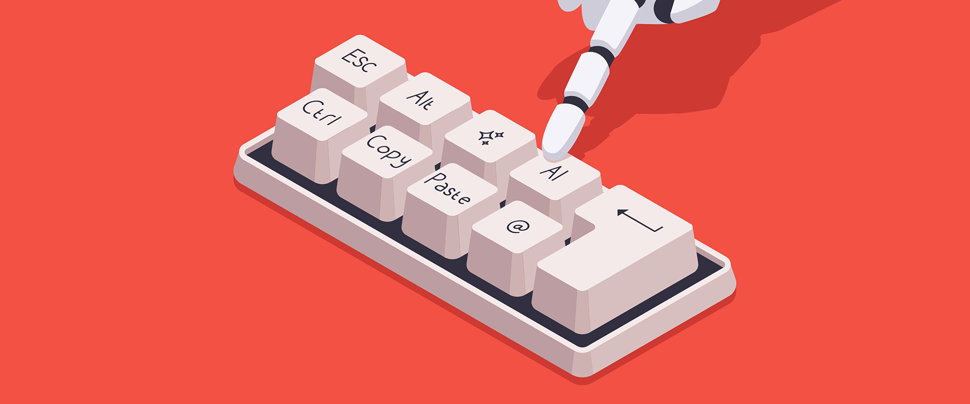
But what is different from 2023 is that with AI, we now have to figure out how our daily work as researchers changes and can be supported by it. In this article, we want to take a closer look at the handover phase: from researchers to designers.
But first, let’s briefly go over two points that changed what makes UX research important in the age of AI:
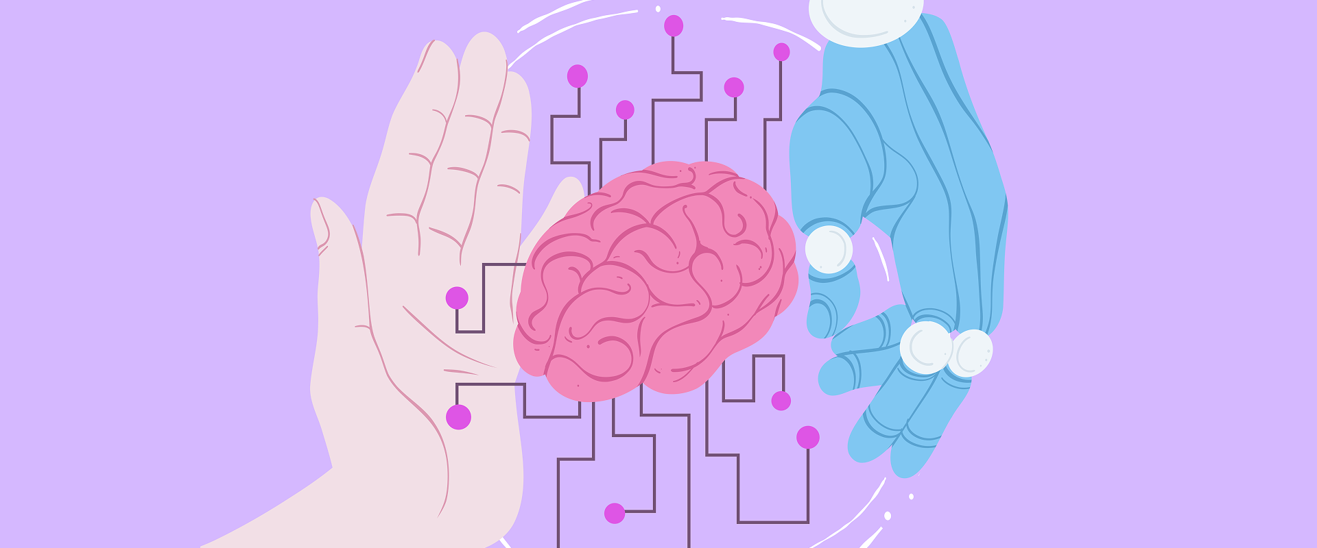
With AI being capable of taking over more and more design tasks, the human part of understanding your user is even more important. So nowadays, the hard part isn't the research anymore. It's getting the right insight to a designer the moment they need it.
The question for us was, how? Let’s see how we figured it out.
One quick detour before we go into how we approached research activation: the problem of research knowledge dying. Unfortunately, it tends to die fast, and in general, there are two problems that can cause this:
The real cost of this isn't theoretical. It's that we rerun studies we've already run and retest hypotheses that have already been validated. Research is expensive, and losing that knowledge means you wasted time and money.
The compounding value of research, where one project's insights save a great deal of work for the three projects that follow, only kicks in if those insights are findable and usable. Otherwise, every study is a one-time asset that loses value the moment the project ends.
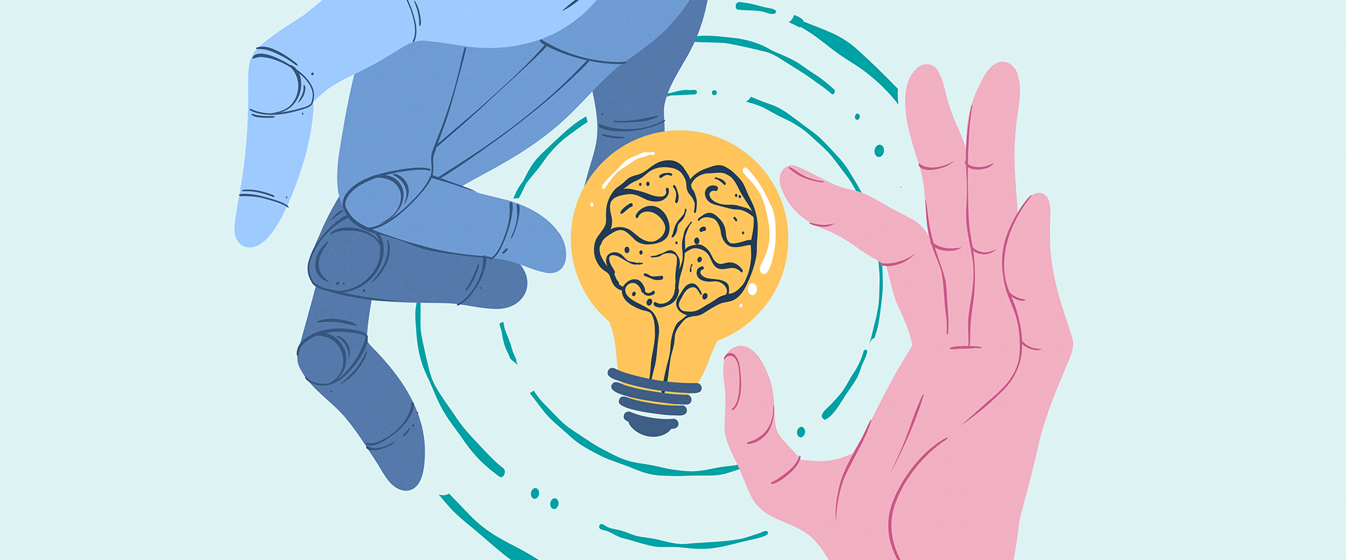
Simple insights documentation isn’t the goal, but rather, the aim is to make insights more accessible and activate them. What we want to achieve is less friction between "research said this" and "design does that." We want to make it feel natural. We want it to become “users behave like this” for our conceptors and designers.
Let me walk you through three things we tried: moving research into FigJam, using Insight Cards, and using AI-generated “How Might We” questions.
First, we moved synthesis out of slides and into the design environment itself, starting with FigJam, Figma’s visual collaborative whiteboard.
This way, research was referenced more (because designers literally couldn't avoid scrolling past it), but the underlying problem was still there: research was just visible, not actionable.
The second attempt was Insight Cards: small, structured cards that researchers would copy next to the tested screens and that designers would copy during concepting and designing.
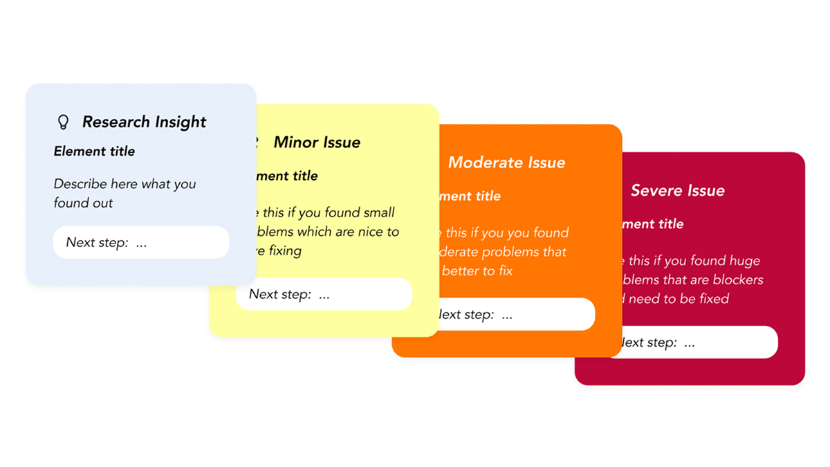
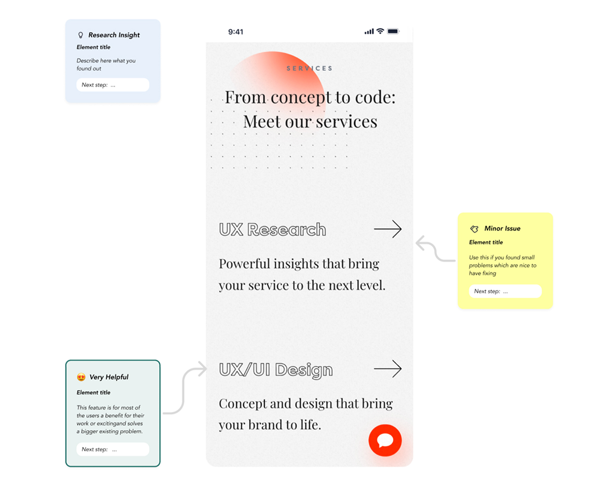
On paper, this looked like the answer, but in practice, it didn’t always happen. The cards required too much manual effort, as there was no embedded trigger telling a designer "use this insight now,” so the workflow got skipped most of the time, no matter how good the intentions were.
That was one useful learning, which made us go one step back and dig deeper into the heads of our designers, especially since our researchers are UX designers themselves.
We basically asked ourselves as UX Designers: how would we like to use the insights, and how might we base our design even more effortlessly on research insights. And there it was: The “How Might We Question”. Such a simple change of wording that made us take an action.
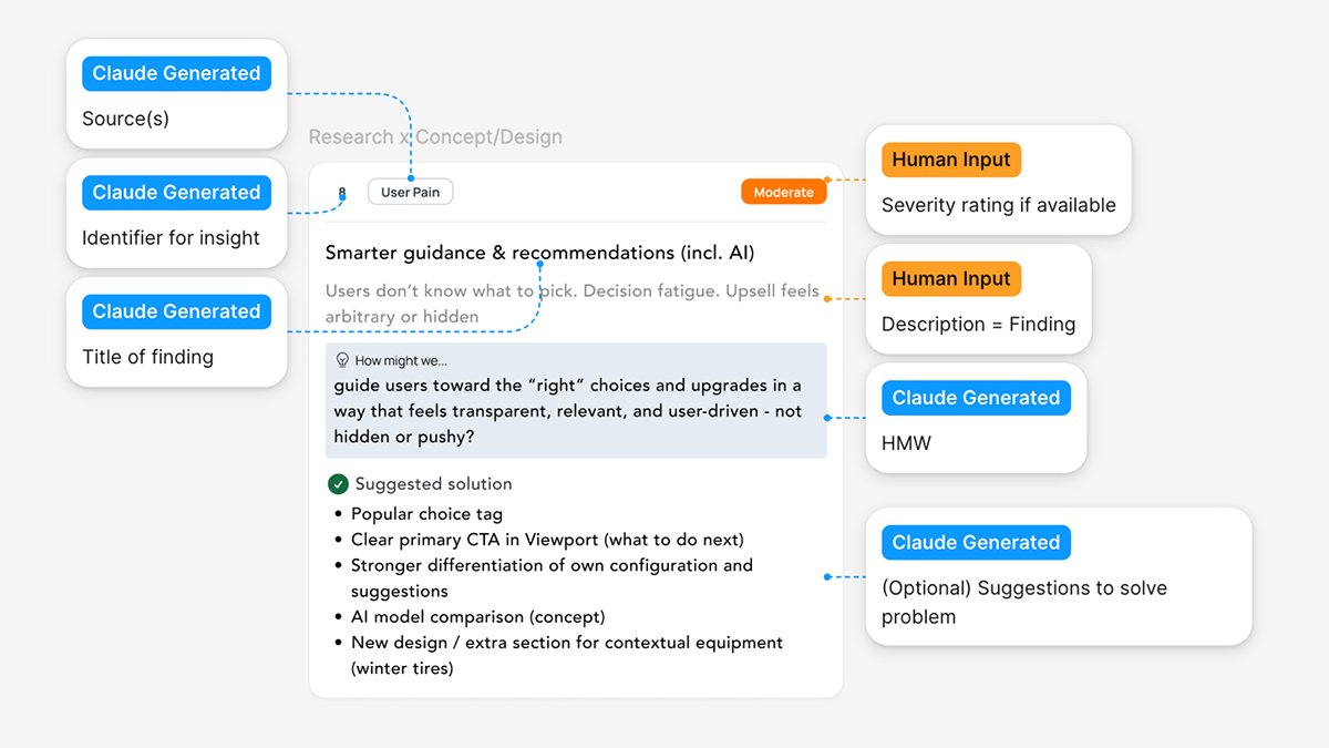
This is how it works in practice: instead of asking designers to read raw findings and figure out on their own what to do about it, we use Claude to help convert findings into HMWs, enriched with benchmarking notes, severity tags, and a couple of solution-starting points, if available. Simply put, AI helps translate our work from “what we learned” into “what we could do about it”. This means that both the researcher's effort to translate and the designer’s effort to understand drop dramatically, while the output itself is presented in a format designers can actually act on.
Here are two examples of what this looks like in practice.
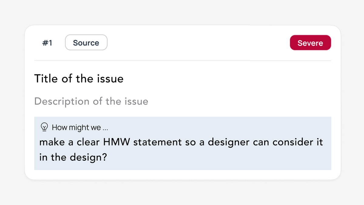
HMWs work because designers already think in them. Whereas a descriptive insight might say: "Users are confused by the onboarding step," an actionable insight would say: "How might we make the onboarding step self-explanatory for first-time users?" That sentence immediately puts you in design mode, and you can't read it without your brain starting to generate options.
It’s the difference between an insight that gets read and an insight that gets used, because it doesn’t interrupt the designers’ process: it’s a question they might already naturally come to. And now that AI can generate HMWs from raw findings at little cost, our work scales in a way it didn’t when researchers were writing them by hand (of course, they are double checked, but for a first run, it’s already working smoothly).
So far, we’ve focused on the direct handoff after a research project ends. The next step is making insights from past studies accessible for future, similar projects, as well as surfacing patterns across studies.
The first is a living research repository. Not an archive: that is where research goes to die. A living repository has searchability, freshness signals, and discoverability built in. Recurring pain points across studies become design principles, while insights get tagged by theme, product area, and recency. We're also experimenting with dynamically generating Insight Cards via Figma MCP from a research database, so the right finding can surface inside the design environment at the moment it's relevant.
The second is something we’re calling Concept Buddy: an AI assistant that brings up existing project research insights and UX standards during concepting before designers even go looking for them. The idea is that designers can validate a design they’ve created and receive an answer like:
"Your concept flow deviates from the Service Blueprint 'Step 3' and violates the 'Flexibility & Efficiency' heuristic. Here's the gap..."
The setup would be a Claude-backed Concept Buddy with research insights (Service Blueprints, User & Customer Journeys, Personas, Workshop Documentations, etc.) preloaded. It would have three functions:
The point isn't to replace design review with a robot. It's to give designers an assistant they can pressure-test work against any time and make research even more accessible.
When AI ships interfaces in seconds, design systems define what's machine-buildable, and product teams are expected to move faster, we have to make sure that the data we’ve collected is quickly accessible to both our designers and AI. So both can ship products that are based on real data and real user needs.
Nevertheless, finding ways to use AI to make our research even more actionable and not just documentation is always a work in progress, but worth sharing. In 2027, we’ll probably already have some new tactics, because currently we are learning new things every day.
If you're rethinking how research fits into your product process and want to compare notes, we're around. In the meantime, we’ll continue experimenting with how Claude can make us more efficient in Research. Keep you posted!
Michaela is a UX Researcher and UX Concepter at COBE, committed to always finding better ways of conducting and utilising research.