9 min read

Published
February 19, 2026
Why Design Systems Matter to QA

Amela
QA Engineer
You’ve downloaded a new app on your phone and started it up for the first time. It looks nice, performs well, but you’ve noticed something is… off. Maybe you haven’t even thought about it, but subconsciously your brain has noticed something isn’t quite right.
The more you use it, the more you notice the inconsistencies. Sometimes you have to click “X” to close a window, sometimes you have to click “cancel”, while other times there is no button at all and you have to use your phone’s system navigation to go back. This may feel like a minor issue, but a whole bunch of them will make you end up with a product that is inconsistent, confusing and unpredictable for users
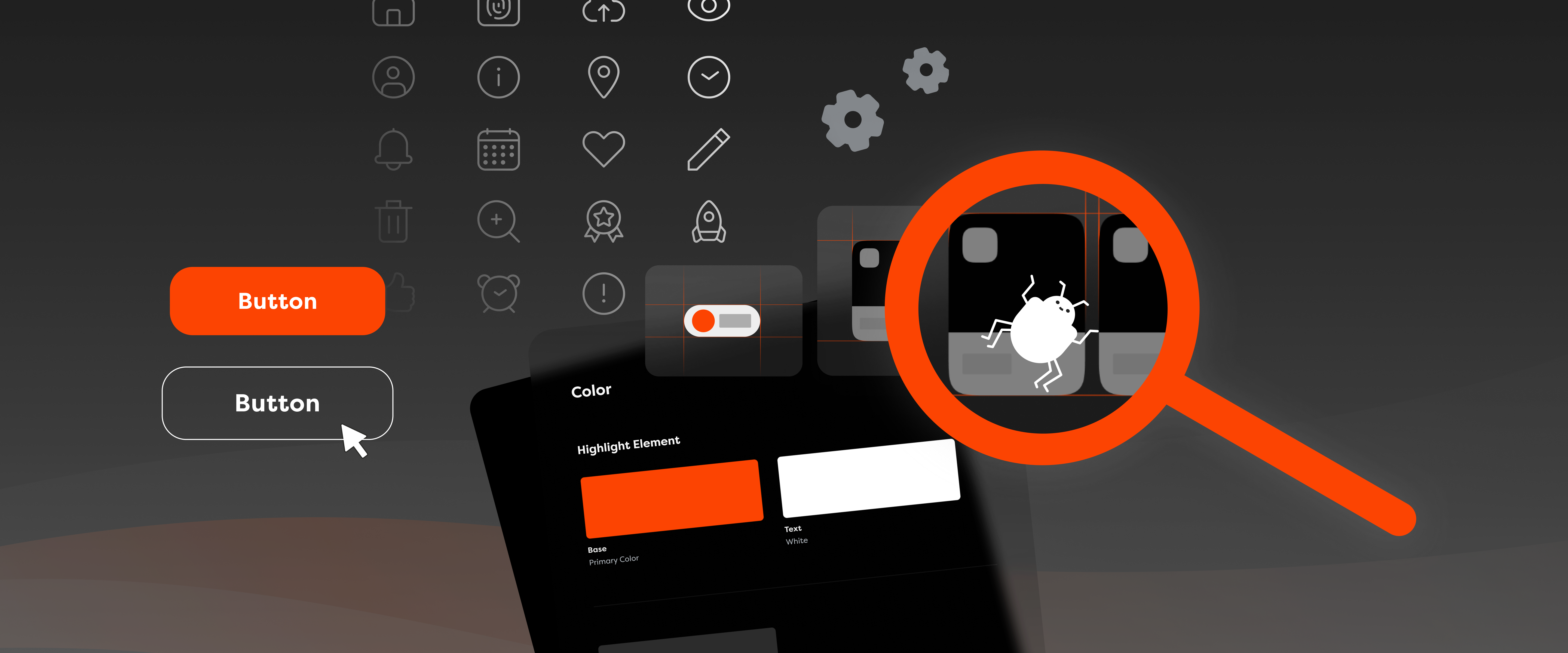
What this app likely lacks is a design system – a framework that documents all visual principles, component libraries, behavioural rules, and methodologies used in a project – and from a quality assurance perspective, that can be a nightmare scenario. Do you think I’m being dramatic? Allow me to defend my case!

A design system directly improves the quality of your entire product by ensuring that element behaviour and the UI are consistent and adhere to best UX standards. In practice, that means there is a standard that allows the QA and development teams to follow along without running into sudden hurdles, while the finished product feels like a complete package with a story of its own.
Let’s say an app has several different forms: registration, login, checkout, and edit profile. Without a design system, users will run into a makeshift nightmare where each form behaves differently. Who wouldn’t get confused? With a design system as the single source of truth that defines product behaviour, inconsistencies and ambiguity can go right out the window.
When a QA engineer has that single reference for components, patterns, and interactions, they’re happy and thriving, as it becomes that much easier to validate quality across the product, directly improving reliability and consistency. At the same time, behaviour is standardised and users know what to expect when using any form.
Simply put, there won’t be seven different, random variations of an error function. Can you imagine going about fixing that? Allow me to proceed further with my case!
Without a design system in place, QA tends to deal with extra risks, such as additional bugs. Oftentimes, it’s the only department that considers cases not covered by specific design screens. Pray for the QA department, because this means confusion and bugs become a regular part of day-to-day work. If the process within a project is set up properly, issues can be caught early on, but more often than not, they slip through development and are usually first recognised during the testing phase.
Here’s an example for you. Imagine you’re working on a project that has a design system, but the behaviour in modals, like pop-up dialogue boxes, isn’t defined. Some have an “X” icon to exit, some have a “cancel” button, while others can be closed by simply clicking outside the modal or pressing the ESC key. Without a single defined modal pattern, each developer will then implement it differently. Safe to say, it’s like a game of broken telephone.
Once testing starts, confusion is inevitable as users might accidentally dismiss important inputs, as well as get stuck and not progress any further. Upon reporting, all models of the same components will have to undergo a redesign to align on a common standard.
This type of mistake can be a major setback for the project, as the process will have to go all the way back to design, through all the people and processes involved, and at least double the effort required. Had this been defined in a design system, the disaster could have been avoided altogether.
I want us to think positive, and even though this is an imaginary example of something “minor”, it can happen in reality and cost the team a lot of time and effort. And the cost of not utilising a design system can be even more significant!
This is especially true from a QA perspective. A sharp QA eye notices a colour is slightly off, checks the code, and confirms it’s the exact one. But if there’s no design system in place, it’s possible that even in the design the colours do not match throughout the app, and then all of these single-occurring instances have to be found, reported and fixed – both in design and in implementation.
Visual inconsistencies may have lower priority than functional issues, but here at COBE, we strive to deliver pixel-perfect design through product implementation. It does not only fix appearance itself, but also commonly means the application is more user-friendly, intuitive, and generally more usable. Just imagine, the button to proceed being red and the cancel button being green – you’re probably not just reporting the design, you’re judging the designer for their choice.

Aside from visual bugs, text behaviour can be even more problematic. If typography is not defined in the design system, you’ll see text vandalising places it shouldn’t. Even worse, the UI may break down and become unusable. It’s common to use placeholder texts during development, but trouble arises once real content starts coming in. As this is usually at the latest stages, most close to release, fixing these issues is hardest and most expensive, and just extremely annoying.
If all states are defined in the design system, we can check everything faster and more reliably. Without a design system in place, QA must rely on experience and has to make a decision if something behaves by general standard or not, or do the repeated work of going by a designer to have it approved. Ultimately, it‘s just a giant waste of time.
Communication between design, development, and QA is significantly improved with a design system in place. Why? Because almost every discussion, misunderstanding or question about visual identity can be solved by addressing the design system. QA can focus more on integration and functional testing, rather than testing each screen element individually. It’s a huge win for productivity, reducing fatigue, enabling QA to identify more functional issues, and focus on building a higher-quality product.

Let’s also talk about QA and accessibility checks. Design systems are of great help with accessibility, as strict rules are enforced, significantly reducing the likelihood of errors. For example, with colours defined in the design system, accessibility compliance, such as contrast requirements, is already included. Or if font sizes are defined in the design system, there is no room to make a biased opinion, avoiding discussions of taste and opinions.
The same applies to element states. By accessibility standards, all elements should be accessible by assistive technologies and keyboard. With keyboard navigation, each element will reach its focus state. If it is not defined in the design system, it will be non-existent, non-compliant or not the same within the application – directly impacting usability and accessibility compliance.
A strong design system must ensure accessibility is built in and not an afterthought. It must ensure consistency across the product and reduce the risk that one screen complies with standards, while another does not. Unfortunately, this can happen often when components are implemented differently across the application.
As you can see – there’s so much that can go wrong without a design system!
Remember how I said a lack of a design system can be a nightmare scenario? Perhaps it’s not a huge issue if it’s one or two instances of running into something undefined. But when it’s a hundred things, it can be a significant waste of time. It means you may miss edge cases because you simply do not have enough time to test everything.
From a QA perspective, it’s not about making things nice, it's about making quality repeatable, sustainable, and testable. You can look at it as having building blocks and rules for building a house. Each part of the house can be done on its own, but when rules and standards are set, everything will be integrated, and the house will not end up having different windows, wall heights and flooring – or even crashing, in the worst case scenario.
In other words, design systems are the blueprint for a successful product. When rules are strictly defined, testing can be planned well ahead, potential issues can be discovered earlier, risks are reduced, and few surprises arise later in development. Which makes QA more than a corrective experience – it makes it one that truly improves the end product.
Don’t hesitate to reach out if you’d like to learn more about how a design system can help you, as well as check out our article highlighting how our DesignOps’ approach ensures full alignment across all our teams so we can avoid these kinds of scenarios.
Amela is a Quality Assurance Engineer. Besides catching bugs, she enjoys learning languages, and doing DIY projects.